JEWEL books cover designs
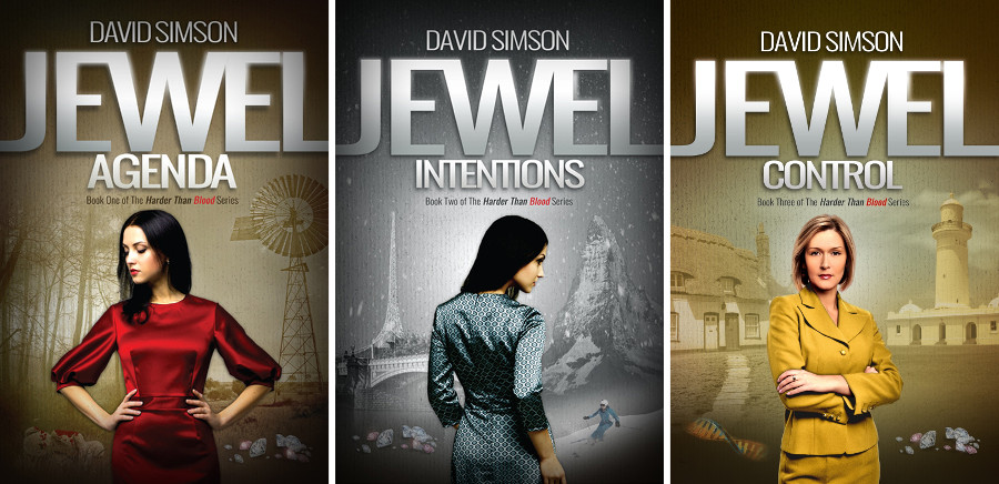
FRONT COVERS
Central character
A primary female character in the foreground.
Split screen
Either side of the central character a background image representing a different country.
Themed colour
Each book carries a themed colour.
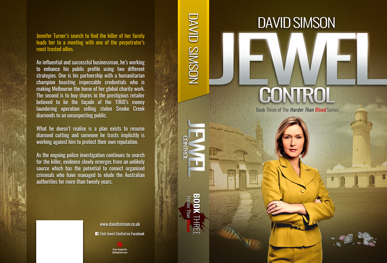
The top of the spine and the first few lines of the blurb on the rear cover are all in the themed colour - red on JEWEL AGENDA, blue on JEWEL INTENTIONS, ochre yellow on JEWEL CONTROL and green on JEWEL OUTCOME..
REAR COVERS
Trees
Either side of the blurb on the rear covers are trees. This is a deliberate design intent to make the rear covers as consistent and recognisable as the front covers.
On JEWEL AGENDA it is the French forest; home of the original contract murders. On JEWEL INTENTIONS are snow capped Italian trees, on JEWEL CONTROL are eucalyptus and on JEWEL OUTCOME a dense forest with ferns.
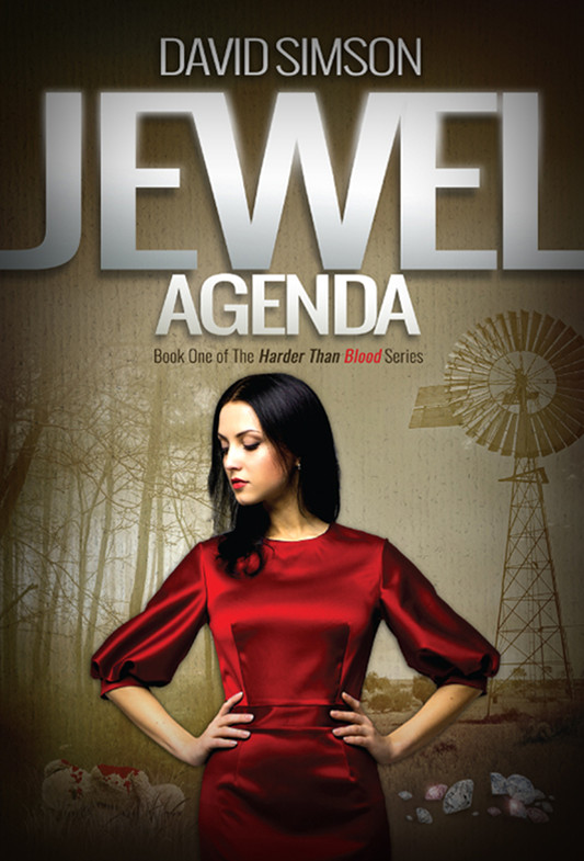
The history of the cover design for JEWEL AGENDA, is a long story in itself.
The very first design idea, way back at the end of 2015, was completely different.
At this point the manuscript was a ring binder containing hundreds of printed A4 sheets. Other than me, very few people had read it. A friend of mine said she wanted to so off she went with the ring binder.
When she returned, her first comment was the cover revealed too much of the plot.
She then suggested the split screen with a central character standing in the foreground and a different background scene either side of the character.
In one suggestion my friend had created the unique 'look' for the series.
On JEWEL AGENDA, the French forest is on the left and the Australian outback on the right.
There was still a lot of work to do with finding suitable images to place either side of the central figure but the brand had been created.
Little wonder she appears in the Acknowledgements page of every title...!!
And with the brand came the colour themes. The red of JEWEL AGENDA is clearly shown by the woman's dress and the blood spattered teddy bear.
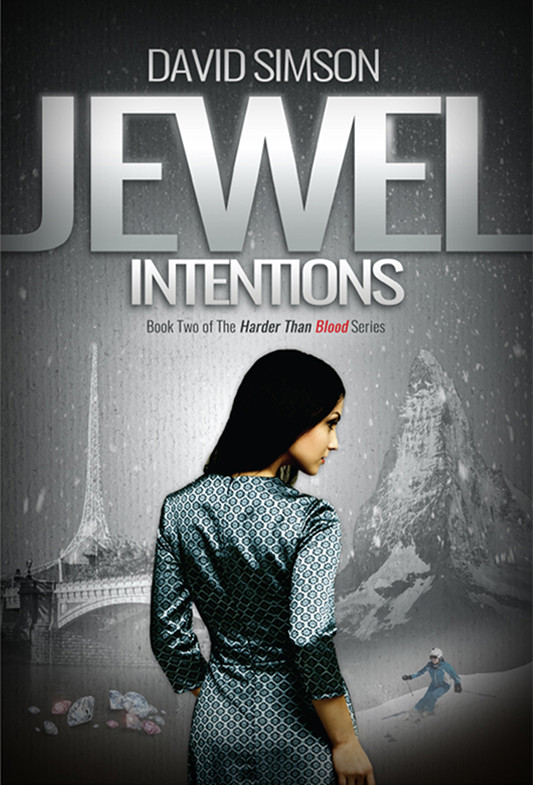
Now with a clear design theme, the cover of the second book was considerably easier and the idea for JEWEL INTENTIONS was already forming.
The perpetrator had fled to Italy and with winter approaching headed to the mountains to the north of Milan.
This made the choice of one half of the cover obvious. An Italian mountain and in the foreground a skier dressed in blue - again - another direct link to the storyline.
The other side some people mistake for Paris but it is actually the Princes Bridge carrying St Kilda Rd across the Yarra River and past the Victorian Arts Centre in Melbourne.
As with the first book, a prime character stands in the centre.
The font style for JEWEL and INTENTIONS was lifted straight from the cover of JEWEL AGENDA.
With the cold winter scenes on the cover, the colour theme for JEWEL INTENTIONS could only be blue.
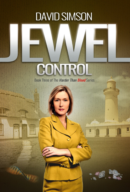
JEWEL CONTROL
Here the core colour is ochre yellow but the brand identity remains the same.
The left hand side is a Sussex cottage which has a direct link with two of the characters from the original diamond mine in Western Australia.
The right hand side is the Macquarie lighthouse which sits slightly down the coast from the southern headland where Sydney Harbour meets the Pacific Ocean.
The design language common to all books is clearly shown with the completed cover for JEWEL CONTROL