JEWEL CONTROL
Jennifer Turner’s search to find the killer of her family leads her to a meeting with one of the perpetrator’s most trusted allies.
An influential businessman, he’s working to enhance his reputation using two different strategies.
One is his partnership with a humanitarian champion with impeccable credentials who is making Melbourne the home of her global charity work. The second is to buy shares in the prestigious jewellery retailer believed to be the façade of the 1960’s money laundering operation selling stolen Smoke Creek diamonds to an unsuspecting public.
What he doesn’t realise is a plan exists to resume diamond cutting and someone he trusts implicitly is working against him to protect their own reputation.
As the ongoing police investigation continues to search for the killer, evidence emerges from an unlikely source which has the potential to convict organised criminals who have managed to elude the Australian authorities for more than twenty years.
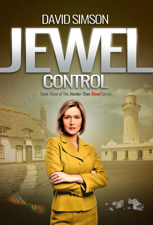

Above is the final, completed version of the JEWEL CONTROL cover.
People familiar with JEWEL AGENDA and JEWEL INTENTIONS will note I have stuck to the same branding on JEWEL CONTROL..
This makes all of books instantly recognisable as belonging to the same series.
Central character
A primary female character in the foreground.
Split screen
Either side of the centre character is an image representing a different ountry
For JEWEL CONTROL England iis on the LH side and Australia is on the RH side.
Themed colour
Each book designed to have a themed colour. - in this case it is ochre yellow.
Consequently, the top of the spine is in the theme.d colour
The first few lines of the blurb on the rear cover are the same
Branded trees
Either side of the burb on the rear cover of JEWEL CONTROL are trees - in this case eucalyptus
This continues the theme of trees on the rear covers.
On JEWEL AGENDA it was the French forest and on JEWEL INTENTIONS the snow capped Italian trees.
It won't be any surprise the same design language will be used on JEWEL OUTCOME.
